As a WordPress Consultant, this CMS is clearly a big passion of mine, that is why I keep updated and read as much as I can about how to improve both mine and my clients’ experience with it.
Developing themes and plugins for WordPress, but in general anything website or web app today, requires a wide range of skills, which go from web design / front-end development, user experience knowledge, user interface best (updated) practices, more than just elements of graphic design, PHP, mySQL, Javascript, JSON, Ajax, devices and operative system knowledge, browsers’ diversity, typography….
When your job is to do, or supervise, all of this… you HAVE to constantly read and improve your skills to stay on top of web technologies and opportunities.
So I’ve recently read an article (on a famous WP blog) that made the reader think they had found the perfect formula to how to adapt a theme to any device/size.
I was quite disappointed when the information I found in it was old and incomplete…. clearly lots of websites care more about selling through their traffic, than actually writing good content.
[mt]
However useless, that article had just a few good reminders for developers: WordPress DOES have a built-in mobile detection system, which stores certain variables for use within the template pages.
$is_chrome //also detects Chrome Frame for IE

$is_firefox

$is_winIE

$is_macIE

$is_IE //includes bot win and mac IE

$is_safari //this will also trigger a $is_phone = true, if we are using a mobile device

$is_gecko

$is_opera

$is_NS4
WordPress also knows what server software you are using, but this takes things to a different level, than the average site responsivness / cross-browser compatibility issues.
We are also given a very interesting function
wp_is_mobile()
which however doesnt differentiate between smartphone and tablet, and will only return true or false, but is a good starting point to gross-refine a lot of the mobile user interface and experience. This function will successfully detect 90% of all iOS devices (iPhone and iPads), Android, Blackberry and Kindle.
However, because of its limited detection capability, as to what OS or what size the device is, it’s best to keep this native function as a fallback, or for general mobile differentiation, only.
An example could be:
if ( wp_is_mobile() ) { // if it's a mobile device...
$depth = 1; // the depth of my menus will only be of first level, therefore no submenu or subpages will be displayed
}
else { // if not...
$depth = -1; // then leave my menus with all the level depth it usually has
}
$menu_args = array(
'depth' => $depth,
);
wp_nav_menu( $menu_args );
To really diversify our functions and layouts, depending on what device we are dealing with, I suggest you play with these 2 plugins (not at the same time): WP Mobile Detect and mobble, because they provide that more in-depth detection that we need, such as:
// WP Mobile Detect

wpmd_is_notphone() - Returns true when on desktops or tablets

wpmd_is_nottab() - Returns true when on desktops or phones

wpmd_is_notdevice() - Returns true when on desktops only

wpmd_is_phone() - Returns true when on phones ONLY

wpmd_is_tablet() - Returns true when on Tablets ONLY

wpmd_is_device() - Returns true when on phones or tablets but NOT destkop

wpmd_is_ios() - Returns true when on an iOS device

wpmd_is_iphone() - Returns true when on iPhones

wpmd_is_ipad() - Returns true when on iPads

wpmd_is_android() - Returns true when on Android

wpmd_is_windows_mobile() - Returns true when on Windows Mobile
// mobble

is_handheld(); // any handheld device (phone, tablet, Nintendo)

is_mobile(); // any type of mobile phone (iPhone, Android, etc)

is_tablet(); // any tablet device

is_ios(); // any Apple device (iPhone, iPad, iPod)

is_iphone();

is_ipad();

is_ipod();

is_android();

is_blackberry();

is_opera_mobile();

is_symbian();

is_kindle();

is_windows_mobile();

is_motorola();

is_samsung();

is_samsung_tablet();

is_sony_ericsson();

is_nintendo();
mobble can also append the device name to the body class, helping front-end developers with custom layouts and functionality.
As an addition, code-wise, even though it can be achieved with the use of CSS3, a plugin can help us have images resized to perfection automagically, no matter the device or viewport size: New Nine Adaptive Images
[mt]
However, I feel like while these are great helpers, it’s not thinkable nowadays to rely so heavily only on PHP, which is still a server-side executed language and can only serve us to a certain extent (once the whole page is visible on the screen, PHP won’t help us changing anything else from that point on).
Athough they weren’t born to help us make websites and apps responsive, frameworks are our other best friend, when it comes to user interface optimization, for any device.
The combo PHP + Framework can truly win all the responsivness and device diversity issues, as we can manipulate effectively not only the code and the functions, but also the UI and UX.
Personally, I’ve been using the Twitter Bootstrap Framework for the past 2 years, while other ones were still growing, like Foundation, which has started gaining my attention the more and more, since their last release, v5.
Leaving to another day what Frameworks do it better, the important choice to even use one, is now a must for any front-end developer who knows how things should be done.
Frameworks have all the javascript and css helpers for at least 70% of what an average website needs.
The advantage is that their code is being used, checked and improved every day by thousands of people, which makes them reliable and always up-to-date tools (just like WordPress itself).
We can then use Media Queries (these are taken from Foundation) such as:
// Small screens @media only screen { } /* Define mobile styles */
@media only screen and (max-width: 40em) { } /* max-width 640px, mobile-only styles, use when QAing mobile issues */
// Medium screens @media only screen and (min-width: 40.063em) { } /* min-width 641px, medium screens */
@media only screen and (min-width: 40.063em) and (max-width: 64em) { } /* min-width 641px and max-width 1024px, use when QAing tablet-only issues */
// Large screens @media only screen and (min-width: 64.063em) { } /* min-width 1025px, large screens */
@media only screen and (min-width: 64.063em) and (max-width: 90em) { } /* min-width 1024px and max-width 1440px, use when QAing large screen-only issues */
// XLarge screens @media only screen and (min-width: 90.063em) { } /* min-width 1441px, xlarge screens */
@media only screen and (min-width: 90.063em) and (max-width: 120em) { } /* min-width 1441px and max-width 1920px, use when QAing xlarge screen-only issues */
// XXLarge screens @media only screen and (min-width: 120.063em) { } /* min-width 1921px, xlarge screens */
Which can be further customized and used together with other CSS statements. The advantage to use a system that has already built-in the logics to make your website work like this, is the flexibility, that you could never have only with PHP.
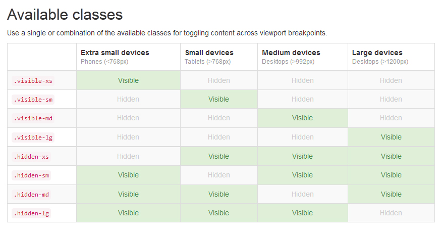
Or you could use helper classes (see Twitter Bootstrap) to hide certain parts of the layout, for certain screen sizes, without changing a single line of code inside your functions.
The classic approach “desktop first” is obviously obsolete now, but also the “mobile first” approach doesn’t really answer the needs of users: it’s only by mastering all of these tools together, the web can be made truly responsive.
[mt]