When booking a holiday, everybody loves a disaster free experience. Trawling the web searching for the cheapest airline can become a chore, and the cheap air fares of low-cost, budget airlines are certainly reflected in their web design.
Airlines have never really progressed with design trends, therefore causing a confused user, overloaded with homepage information of endless offers, and a complicated search field.
So here is my run down of The 10 Worst Airline Disasters on the Web!
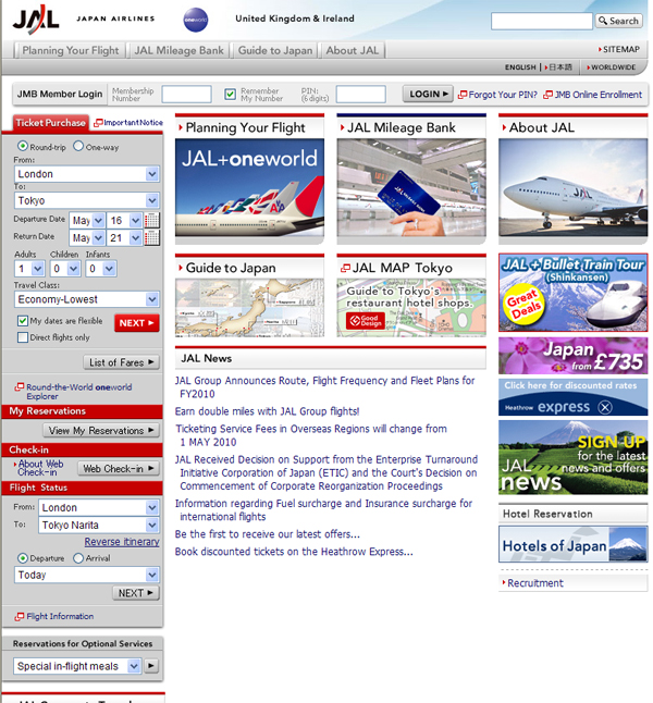
10. Japan Airlines
At number 10 we have Japan Airlines. A colour scheme of red and grey could be nice if executed well, but this website looks dated and unorganized. The left side-bar maybe be simple and clear layout wise, but some buttons e.g. “Web Check-in” seem to get a little lost and blend in.
The placement of a horizontal login bar underneath the navigation menu is, in my opinion a big mistake. Everything towards the header is far too cramped, not leaving enough room to breathe at the top, and a huge white space at the bottom of the page.
I feel the placement of images with page options is a good idea e.g. Planning your flight, however they do not need to be repeated again in the navigation menu at the top of the page.
The JAL News section looks like a mess of text rather than individual news bulletins. The use of the same colour font which is also poorly spaced causes the reader to disregard the text immediately.
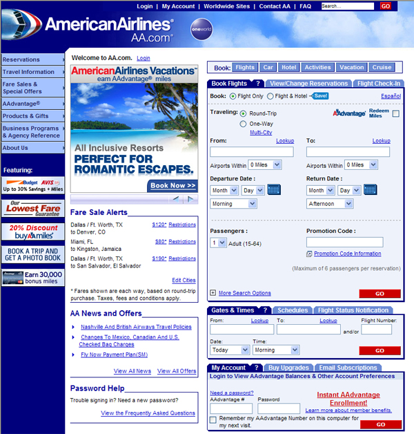
9. American Airlines
For some reason when viewing this website I feel tense. The organization (or lack of) is just all wrong. The vertical menu on the left of the website probably annoys me the most. It is just so unecessary and the fly out sub menu is just horrific.
The Fare Sales Alerts and News Section does not have any clear definition and the mix of blue and black text is not a pleasant combination. The “Password Help” box seems to be completely irrelevant, and this option should be located where you sign in, rather than randomly on the homepage.
The “Book Flights” section has all the necessary fields and my main qualms with this are only small details. The tabs at the top are far too small, and the text inside is cramped. Also, the strange solid blue drop shadow around each box. I assume the logic behind the bright red “GO” button, was that it is supposed to stand out against the blue, but in my opinion it is ugly and could have been achieved in a much better way.
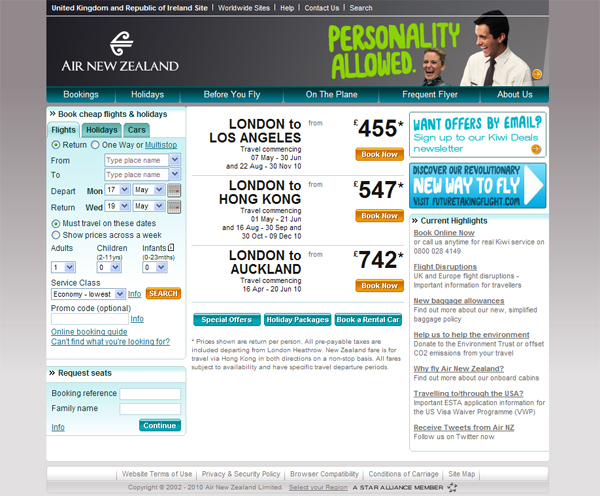
8. Air New Zealand
There are some functions about this website that I actually think are good. The tab selection menu under the “Book Cheap Flights & Holidays” box is a good, functional element. However, the design and execution is still dated which I think is caused by the gradient and the colour and style of the “Search” button. The cheap deals in the center of the page are well organized and clear, however to make this website more dynamic the offers could change every so often and again the colour of the “Book Now” buttons are completely random.
The header image with the bright green text advertising their new in-flight advert is inappropriate and the orange arrow to the right is barely visible and certainly doesn’t indicate that this leads to another page. Also, the gradient of the menu doesn’t fit in with colours and gradients already placed within the homepage, and some of the options in the sub menu could have easily been situated on the homepage rather than creating long drop down menus.
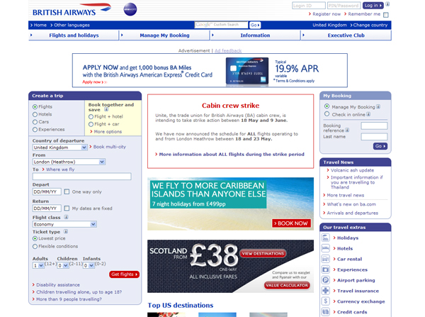
7. British Airways
The British Airways website also looks dated and uninspiring. The website looks overloaded with text information with not enough emphasis given to images or dynamic content. The “Create a Trip” box is well put together, simple and clear to use. I also like how the Login boxes are placed at the very top of the page and are well labeled.
Instead of just one “cheapest fare” this information could change providing the user with many different destinations and offers.
Even though the “Cabin Crew Strike” notice is important, it takes up a lot of space and I wonder what information would take its place if this bulletin didn’t exist. Also the “Give us feedback” link at the bottom left of the page looks disjointed from the rest of the website and should be included in the footer menu on the right.
6. Aer Lingus
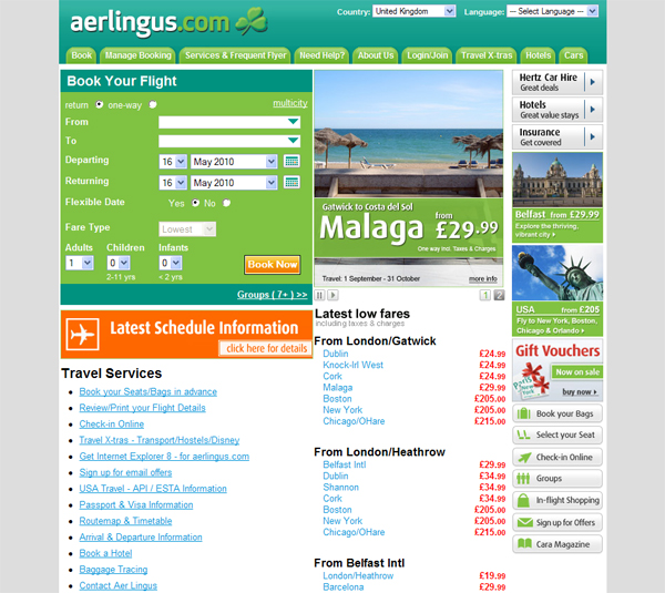
The first mistake of this web design is the colour scheme. Different shades of green and orange combination are not a great mix. I know it’s an Irish airline but still, it’s overdoing it a bit! The orange of the “Latest Schedule Information” is obviously supposed to attract your attention, but there are different, more suitable ways of doing so, unless you are easyjet. For example, the whole button could be smaller and could maybe be located at the top of the pages with the tabs but in a different colour. The “Book Now” button is equally as inappropriate.
Also, the “Latest lowest fares” is displayed in a terrible way creating a lot of unecessary white space and it is just plain ugly!
The only thing I could maybe salvage about this website is the detail of putting a play and pause button underneath the changing offers. This is a functional idea, as sometimes users see a deal they could be interested in but by the time they have gone to click on it , it has disappeared!
5. Jet2
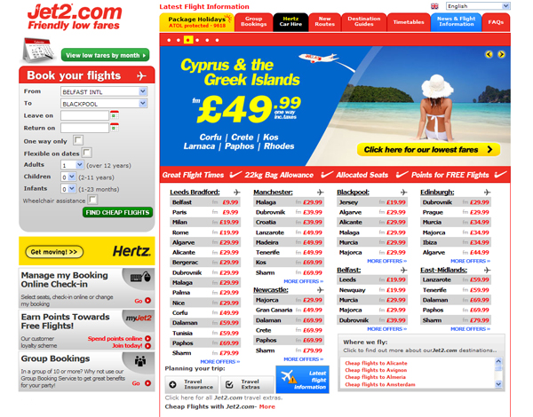
Red. Lots of red. Red menus, tabs, text. Mix it with yellow, blue, black and green and you have yourself a recipe for a design catastrophe. Jet2 is a low cost airline and the website 100% reflects that statement! The flight prices and information in the center of the page is confusing and a little overwhelming and the “Latest Flight Information” at the very top of the page (of course in red) gets a little overlooked and is quite unoticable.
There is far too much happening on this homepage. The only thing remotely functional is the simplicity of the “Book your Flights” fields.
There is one word to describe this website and that is…gaudy!
4. Ryanair
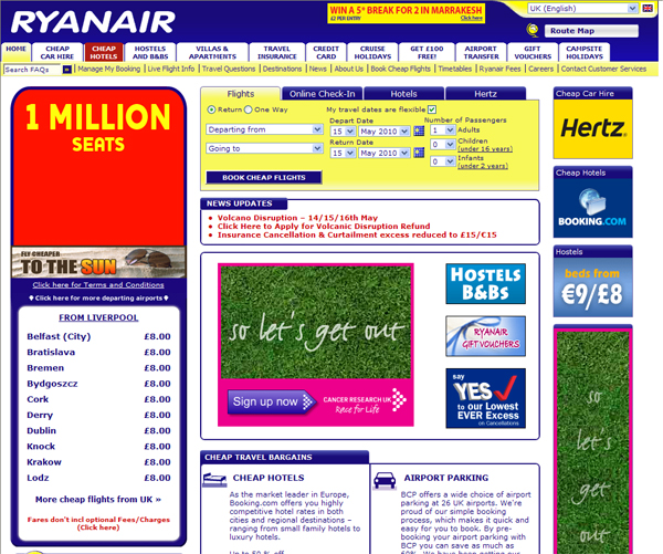
Now, I couldn’t really decide which should go first, Jet2 or Ryanair. However, I put Ryanair at No.5 not just because I had a terrible experience with them a few years ago, but because this site has more flashing elements than a christmas tree. This page is a little TOO dynamic. If everything was just slowed down a little, maybe it would be fine! There are too many elements that could be combined into one to save on space and a headache.
The blue, yellow and red combination is once again a visual disaster. Everything is messy and disjointed and important features such as “Manage my booking” and “Online Check-in” have been pushed to one side.
The huge red “1 million seats” advert in the top left is far too big, and looks dreadful combined with the other dynamic content on the other side of the page.
To be honest, there is nothing I can salvage about this design.
3. Alaska Airlines/Horizon Air
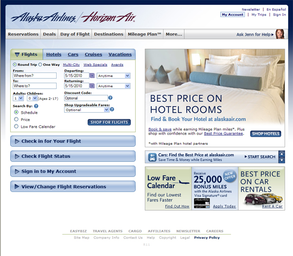
This website looks like someone has tried to give it a facelift and update it with modern features but it still looks dated.
Firstly, I dislike the logo. I suggest they re-do it! It is unclear and contributes to the out of date feel this website has.
I think the use of an accordion menu in this design is inappropriate as options such as “Check Flight Status” should be placed immediately on the homepage, readily available for the user. Again, some options in the sub menu could have been situated on the homepage along with small images or icons.
Again there is really not much I like about this website. It doesn’t even look like a design for an airline!
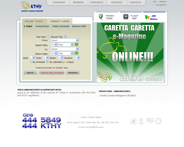
2. Cyprus Turkish Airlines
This also, doesn’t look like a website for an airline company. They also look as though they have tried to update this website by adding some new icons here and there, but it still doesn’t make it any better.
The booking form is clear and simple and I quite like the way the content changes as you click on “Arrival/Dept.” or “Online Schedule.” Having said this, I don’t think it is a suitable method for an airline and would be more suited to a hotel.
The “Promotions and Announcements” and “Press Announcements” seems disjointed and I don’t like the way the information scrolls in from no apparent source without having following announcments.
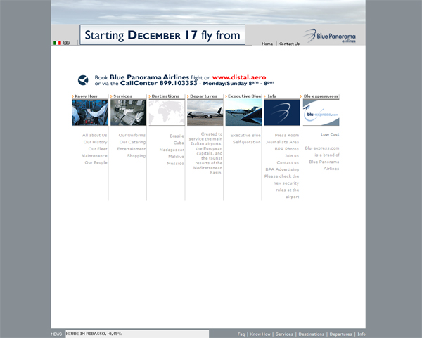
1. Blue Panaroma Airlines
Finally at No.1 we have Blue Panaroma Airlines. This website design is just simply diabolical. An extremely confusing layout, with no function to check flights immediately on the homepage. A big mistake!
The logo is far too small and barely noticable in the top right. The light grey text is difficult to read and the way the images all change at different times is even more overwhelming and would be better if they were all static.
Everything that is wrong with this website, speaks for itself!
Need I say more?
